COLLABORATION
Collaboration
Collaboration was a crucial part of this thesis project. Every week, feedback was received and picked apart to either be used or rejected for each design element. Besides research, feedback was also a driving force behind problem solving as it helped to open new pathways to complete every part of the project from the Onlyness statement to the brand playbook.
Original Onlyness Statement
The Las Vegas Enforcers are the only ECHL team in the Las Vegas area that provide a new sense of joy and appeal in the post-Covid era. These benefits are provided to working-class people, young professionals, and suburban families through connecting with local communities and giving back to supporting communities while still making the prices affordable for everyone.
Regarding the original Onlyness statement, the feedback received explained that the benefits did not support the audience’s need, the target audience was inaccurately identified, and the features were not properly identified & logically related to the features. Since this was the foundation for the project and little was known about an Onlyness statement at the time, all this feedback was taken and used in the refinement process.
Refined Onlyness Statement and Feedback
The Las Vegas Enforcers are the only ECHL team in the Las Vegas area that provide philanthropy to active working adults and suburban families through affordable pricing for everyone, community focused events during games, and making meaningful contributions to their supporters.
For the refined Onlyness statement, the feedback received was minimal, only stating that there should be clarification with philanthropy and affordable pricing. Both words were changed to better fit the brand’s goals and message.
Final Onlyness Statement and Feedback
The Las Vegas Enforcers are the only ECHL team in the Las Vegas area that provide philanthropic acts to active working adults and suburban families through fair pricing, community focused events during games, and making meaningful contributions to their supporters.
All the feedback received led to this final Onlyness statement. By the time of the final statement, much more knowledge was acquired about the importance of this statement, leading to an effective solution on how to create both an informative and impactful Onlyness statement. Neumeier states that to win the positioning game, a brand must ask one simple question: What makes them the “only” (Neumeier, n.d.)?
Using this in combination with the feedback, the Onlyness statement now correctly explains how the Enforcers are the only hockey team in the Las Vegas area that offer unique benefits to their target audience through multiple standout features.
Voice & Tone

For the voice & tone, some of the feedback received was the continued refinement of the Onlyness statement that was showcased above. Besides working on the statement to get it to the final version, the feedback of the voice & tone explained that the selected theme needed to be considered before continuing.
The theme of heroes was a fine choice, but it was important to figure out why the brand could be considered as heroic. A soldier or a police officer could be a foundation for a hero. A good citizen donating to a cause can be considered a hero. Specifying why the actual brand was heroic was the main feedback given. Self-assessment came into play here as it was now a design choice on what defined this theme of heroes for the Enforcers. This theme was later tailored to the idea that the hero theme is that the brand
wants to be both a hero on the ice in reference to a successful hockey team and a hero outside the arena by supporting local communities whenever possible. Brand voice represents a brand’s unique perspective (Verbina, 2021), so it was clear that this feedback and self-assessment was taken and used to further define the theme while also starting to think about designs that could follow this theme.
Original Look & Feel

For the look & feel guide, the feedback received explained that all aspects of the guide were adequate except for the imagery as the imagery choices did not logically connect to other elements or represent a product, audience, or functionality. It is important to align imagery with brand persona and the target audience (Fulmer, 2021), so the feedback was useful when making refinements.
Final Look & Feel

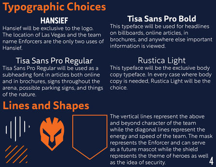
All feedback was used and turned into deeper research of the brand by finding images that were more suitable to the overall brand message and theme. With self-assessment, the look & feel was also altered by changing the shapes, lines, and patterns to fit the brand message and add to the brand identity.
Original Vision Board

The feedback received for the vision board stated that, while all elements were present, design principles were not applied resulting in a lack of visual and conceptual unity. Along with this feedback, self-assessment was conducted, and the result was to clean up the design and find better ways to communicate all the elements of the vision board. Everything was cluttered together and made the visuals hard to communicate the brand’s message and goals.
Refined Vision Board

With the feedback received, the vision board was reconstructed to better suit the Enforcer brand. The feedback for this revision was that the brand needs to be recognized more graphically and not just through photography. This feedback was taken and applied to the final vision board where everything comes together to create a more cohesive and informative layout.
Final Vision Board

Taking all feedback and self-assessment up until this point into consideration, the final vision board reflects the brand theme and message in the most accurate, engaging, and informative way possible. Vision boards help to layout inspiration for which messages and feelings the brand is trying to evoke (Why vision boards, 2019), so it was important for the feedback and self-assessment correction to combine in creating a more cohesive brand vision board.
Logo Concepts
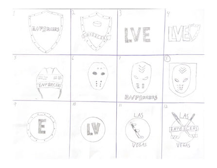
Feedback received for the logo concept sketches explained that while elements in the sketches were conveying the theme, it is important to think about what the theme can mean individually and together. Understanding this can help to paint a better picture for design elements and how they can work well with the theme presented.
First Logo Refinement

Feedback received from the first logo refinement explained that while the shield was coming across clear and being well established with the theme, some elements needed to be reworked slightly. The hockey mask being used worked well with the shield, but it was too reminiscent of a hockey mask from famous movies and therefore took away from the theme and unique brand of the
Enforcers. Self-assessment was then conducted, and this assessment was in agreeance with the feedback of creating a more on brand look for the helmet/mask to give the Enforcers a more unique brand feel.
Second Logo Refinement

For the second logo refinement, feedback received described that the shield logo with the helmet was the strongest idea out of the two best sketches turned into vectors. Feedback also described that this logo could serve multiple purposes as the helmet could be taken away from the shield for a secondary design or even start
the creation of a mascot. Self-assessment for this part of the logo design process was conducted, and this assessment was in line with the shield and helmet design being the greatest representation of the brand’s theme and overall message.
Final Logo Design

The final logo was more of a self-assessment as the best design for the logo was already established. This assessment confirmed that the current logo design was the best way to represent the Enforcer brand as well as add to the brand identity. One attribute that can go the furthest in improving the success of a logo is
simplicity (Hardy, 2011). The feedback received along with the self-assessments conducted used this idea to create a simple logo that still conveyed the brand theme and story while also being informative.
Style Guide

Moving to the style guide, the feedback received expressed a great start to the style guide and continuation of the logo process. Through the conducted self-assessment, besides some minor changes to visuals, it was clear that this style guide was accurately and appropriately representing the Las Vegas Enforcers. The style guide was properly showcasing the voice & tone, look & feel, and logo elements all in one place.
Receiving this feedback and knowing that a brand should consider a style guide as its visual DNA (Costello, 2019), this style guide represents the visual elements thus far and how they relate to the brand story, theme, and message.
Media Asset Concepts
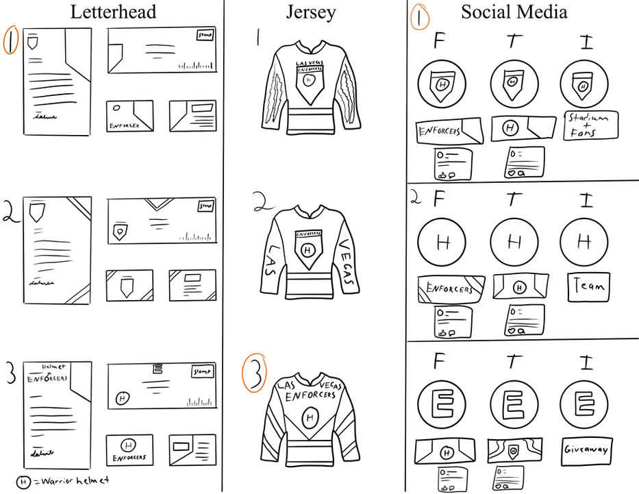
The feedback received from the media assets concepts explained that the design path being taken was a great avenue for expanding the visual aspects of the brand. The feedback also explained how finding shapes, such as the chevron shape for various future designs, is a great way to differentiate designs from competitors and help to make the brand more cohesive and unique. This feedback was taken and added upon when working on each specific asset.
Letterhead Design

For the letterhead design, the feedback received described a few minor refinements that needed to be made. The first minor refinement was resizing some of the design elements as they were taking too much space on the business card and letter. The other refinement that needed to be made was the removal of the colored border as this could cause problems when it was time to print the designs and cut each precisely.
Final Letterhead Design

The border increases the chance of creating inconsistencies within designs so removing the borders made for a cleaner and more efficient design. As with most design elements, the key to letterhead designs is simplicity (Boyd, 2019). Through self-assessment, this final design was much more appropriate for the brand and gave the brand a professional yet engaging letterhead package while keeping the design simple and consistent.
Jersey

The jersey feedback received explained that this was well done and appropriate for the brand. The feedback also explains that this jersey design can excel due to the design being unique while using simple design elements. Through self-assessment, it was clear
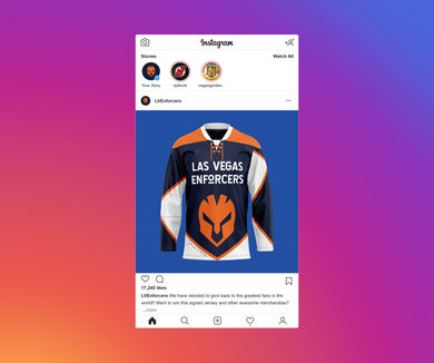
that the jersey followed the brand theme and added to the brand identity by creating a unique piece of branding that will make the Enforcers standout above the competition.
Social Media

For the social media feedback, it was explained that the different design patterns have made the brand more recognizable while still maintaining continuity and identity of the brand. Social media is the number one marketing tool for the future (Hills, 2020), so this feedback and self-assessment conducted make it clear that the social media assets add to the brand identity while also being engaging and informative to fans.
Swag

The feedback received for the swag assets described the continued success of creating different design patterns and graphics that still maintain consistency throughout all designs. These assets add to the brand identity by creating a more cohesive and recognizable brand through unique and eye-catching designs.
Original Logo Animation
For the logo animation, the feedback received explained that while the animation was a great representation of the brand, it seems odd to have the logo explode and no longer see the logo. The feedback also mentions that reversing the video while adding fire to melt the ice may have a greater impact on the audience as it may show that the team is so hot that the ice is no match.
Through self-assessment, the given feedback was disregarded, and a new slightly altered design was created. The purpose of the logo animation was to show that no matter what obstacle gets in the way, the Enforcers can “break the ice” and win the game.
Final Logo Animation
This final logo animation shows the creative direction that took place over the given feedback. While the feedback was insightful, it did not match the final message that this media asset was trying to convey. Since a logo animation can accent a brand’s story (Dillon, 2020), this self-assessment was critical in creating a logo animation that was engaging and informative while also adding to the overall identity and story of the brand.
Looping Animation
Feedback for the looping animation explained that it was a great addition to the swag assets. The feedback also explained that creating something like a jersey reveal with the fire was a nice balance between the ice of the logo animation. Through self-assessment, the only thing added was a small phrase on the side
of the jersey to get fans and viewers more engaged with the jersey reveal. This feedback and self-assessment helped to create a strong looping animation that was engaging while also adding to the overall consistency and cohesiveness of the brand.
Original Brand Playbook


For the brand playbook, the feedback was all through self-assessment. After the original playbook was submitted, the included self-assessment indicated that all visual elements had been placed in the proper positions within their designated pages. The self-assessment also noted that all text was fill-in at this stage as it was more important to layout the brand playbook before
adding in details such as paragraphs that explain the brand story, design elements, etc. At this stage of development, the self-assessment also explained that this design was ahead of schedule as the entirety of the playbook had been laid out and ready to be filled with information barring one page.
Refined Brand Playbook


This final logo animation shows the creative direction that took place over the given feedback. While the feedback was insightful, it did not match the final message that this media asset was trying to convey. Since a logo animation can accent a brand’s story (Dillon, 2020), this self-assessment was critical in creating a logo animation that was engaging and informative while also adding to the overall identity and story of the brand.
Final Brand Playbook


The self-assessment conducted for the final brand playbook described the slight changes made to background design elements and placements to make the playbook even more professional and showcase the true brand identity of the Las Vegas Enforcers. If any brand wants to be effective, it needs to be consistent and eliminate confusion (Barnett, 2018). The self-assessments throughout the month led to a brand playbook that is a consistent representation
of the brand from conception to completion. The assessment also explains that this brand playbook has been created to fully showcase and understand the brand including the brand story, design elements, and media assets that create the overall identity of the Las Vegas Enforcers.
References
Barnett, L. (2018, July 25). Brand guidelines, why do you need them? –. The Glow Studio. https://theglowstudio.com/importance-brand-guidelines/
Boyd, N. (2019, January 8). The best letterhead examples we could find. PRINT Magazine. Boyd, N. (2019, January 8). The best letterhead examples we could find. PRINT Magazine. https://www.printmag.com/design-inspiration/letterhead-examples/
Costello, G. (2019, January 4). Why a style guide is so important to your business. Costello Creative Group. https://costellocreativegroup.com/why-a-style-guide-is-so-important-to-your-business/
Dillon, A. (2020, September 18). Why your brand needs an animated logo. Thirstcreative. https://thirstcreative.com.au/insights/why-your-brand-needs-an-animated-logo/
Fulmer, C. (2021, November 10). 4 tips for choosing brand imagery that will set you apart. The Golden Vineyard Branding Company. https://www.goldenvineyardbranding.com/blog/brand-imagery/
Hardy, G. (2011). Smashing Logo Design: The Art of Creating Visual Identities (1st ed.) [E-book]. Wiley.
Hills, M. (2020, September 5). Social media assets for brands. Splento Blog: Videography & Photography on Demand. https://www.splento.com/blog/photography/social-media-assets-for-brands/
Neumeier, M. (n.d.). The onlyness test. MARTY NEUMEIER. https://www.martyneumeier.com/the-onlyness-test
Verbina, E. (2021, May 11). How to define your brand’s tone of voice: Infographics & examples. Semrush Blog. https://www.semrush.com/blog/how-to-define-your-tone-of-voice/
Why vision boards are the first step to branding success. (2019). Hoot Design Company. https://hootdesigncompany.com/resources/vision-board-first-step-to-branding-success


